atlas sports performance


bridging the gap between rehab and performance
I was given the opportunity to work on this logo for a post graduate, physical therapist his partner/co-founder. This powerful duo dove headfirst into sports rehabilitation and personalized training. Providing over-the-top service for their community.
I worked closely with these two to ensure their vision would withstand the test of time. Their original idea was to have Atlas, the Greek god, holding the world over his shoulders. I thought it was a great idea, but I didn’t want to discredit other ideas. After working up a few different designs, we landed with the “Atlas Horizon” logo. A great symbolization of strong character and simplicity.
The Atlas Horizon logo provides a great sense of confidence, with a thick, bold, font type. Establishing a key component of professionalism, and athleticism. The “arc” or horizon of the logo, is a play on the earth itself. The duality of the logo, much like the business pair themselves, reassures you will be taken care of.
prior logo designs


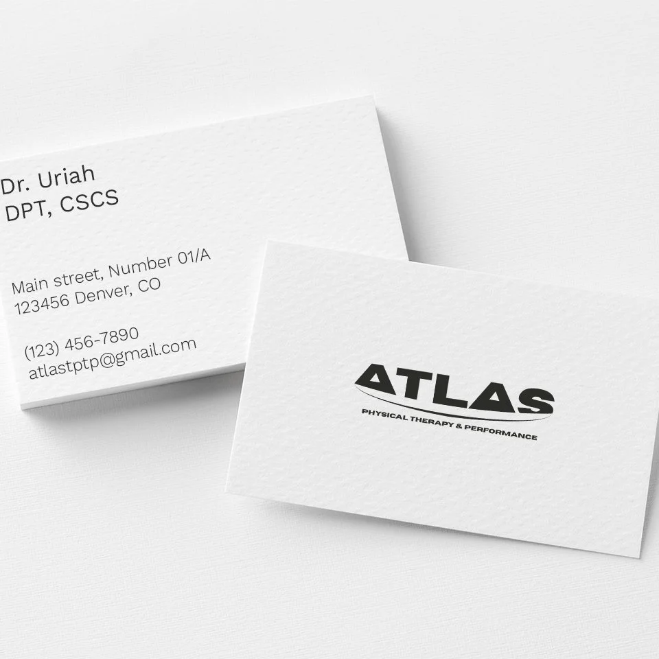
mockups


Contact
For inquiries, contact me here:
marcusacruz75@gmail.com

